Showing posts with label rainbow interviews. Show all posts

Friday, January 27, 2012

Tee Iseminger

This is the 7th in a series of artist interviews based on the colours of the rainbow! It has been a fun and interesting project. What impact did each colour have on the individual's life. What is the strongest memory or association with it. We all have our own unique attachments.
Today's colour interview is with creative soul  Tee Iseminger,  a quirky writer and photographer who lives in Reno, Nevada.
Tee has two children, a husband, two dogs and three cats. She runs, writes, dreams, and lives life LARGE. Tee is an adventure collector and inspires me to do more! Right now she is studying for her MA in Literature & the Environment.
A lot of stories occur to Tee in colors, she writes in "tones" that way. Colour shapes the way we feel and remember things. You can find more of Tee's work and thoughts on her Tumblr. Worth a visit! With no further ado, here are Tee's colours!


Red: Right away red reminds me of Clifford, from Clifford the Big, Red Dog, one of my favorite book series when I was a kid. It also reminds me of my first suitcase, bright red canvas with big yellow flowers on it. I was four when I used it to run away from home the first time. I packed it, climbed out my bedroom window, and went and sat on the curb at the end of the road until a neighbor saw me and went and got my mother. That was just the beginning of many travels we had together.

 Orange: Orange reminds me of the sand dunes at sunset just outside Alamosa, Colorado, which provide a backdrop to another book I’ve been working on, The Upside-Down Orange Ocean. The nucleus of the novel, and the village it takes place in, is a young autistic girl whose unique way of seeing the world was the basis for the title. It also reminds me of orange rescue tape, which we have copious amounts of hanging around from my husband’s days as a search and rescue tech.

Yellow:  Yellow makes me think of a photograph I took of my daughter when she was five or six, swinging at the playground in Albuquerque. The sun was dropping in the sky, and down there it’s just this enormous, magnificent, fiery thing. She was swinging between where I was standing and where the sun was setting, and I snapped a shot of her silhouetted perfectly, hair aflight, against all that blazing yellow.

Green: Just outside of Valdez, Alaska, we pulled over to the side of the road to take the dog for a walk, and instead ended up spending half the day hiking on the slopes above the road. The landscape was amazing, not just to look at but to be surrounded by,  even to feel physically. I used to think of Alaska as this very hard, cold place, lots of edges, lots of jagged, icy, scary things, and it can be sometimes from a distance. But once you get up close, it’s actually very soft. Under our feet there was such an endless carpet of soft, cushy, comforting green. Coming from Nevada, that was a big change.

Blue:  Lake Tahoe! Hands down. Nowhere else have I seen what must be just about every discernible shade of blue represented in the same field of vision. From turquoise near the shoreline to deep indigo way out there, with powdery blues and silvery blues and even some flat colonials and jewely royals depending on the light and wind on the surface. And then of course you’ve got the gray-blue and purple-blue mountains rising around it, and that deep, deep blue sky. Incredible.

Indigo/purple: Oooh, definitely my wedding night. My husband and I have a history with meteor showers; on our first real date we stayed up all night and watched the Leonids in November 2001, that was really the last good year. There were hundreds of them. A few months later we were out in mountains above Reno and saw a fireball break up in the atmosphere over our heads. Every year after that we’ve made it a trek out to watch the bigger meteor showers, so when we got married several years later, it seemed fitting to do it on the night of the Perseids. We held the wedding at a remote mountain campground in August, brought blankets to lay out for all of the guests, and we all laid by the fire to watch shooting stars. The first few Perseids started streaking across the horizon right about the time the sky was that rich, saturated purple. I’ll never forget it.

Violet/pink: This is a tough one. I’ve only come to appreciate pink in the last couple of years. Before that I would avoid it, shirk it, shun it, anything I could do to disassociate myself with it – I’m not even sure why, now – and so I don’t seem to have many strong memories associated with it. The one that comes to me, though, is the tiny, newborn “pinkie” mouse our dog brought in one afternoon. He found it in the driveway under our truck when we got home, and dropped it gently at my feet by the door. He was still alive, though just barely, as it had been snowing that afternoon and there was no sign of a nest or any other mice under there. We named him Harold, and did what we could, but he only lived a few days. I still have a picture of him on his towel in the shoebox.

Tuesday, January 10, 2012

Daina Scarola

This is the 6th of a series of artist interviews based on the colours of the rainbow! It has been a fun and interesting project. What impact did each colour have on the individual's life. What is the strongest memory or association with it. We all have our own unique attachments.

Today's colour interview is with Daina Scarola, a lovely artist who lives in Lawrencetown, Nova Scotia. She was born in northern Ontario, Canada and moved to Nova Scotia in 1994 to briefly pursue fine art studies at NSCAD University. 
After a series of life's twists and turns in 2003, Daina decided painting was what she wanted to pursue. She bought a book on oil painting and began to teach herself. Daina is now a full time artist, with work in collections throughout Canada and the world. Her work is compelling and full of nature, retro, and surf based imagery.  Lately she has started doing encaustic works.You can see more of her art in her Etsy shop and can visit her on Facebook.
Here are Daina's colours, enjoy....

Red: Reminds me of beautiful flowers- poppies, tulips, hibiscus. And candy! I remember a cherry flavoured old-fashined lolly pop I used to buy at the Circle Smoke Shop in Kapuskasing when I was a kid. It tasted so good. I wish I could find them again but I think they were home-made. Red was the colour of the sun back in 1995 when I tree-planted in northern Ontario. A heatwave made temperatures soar to nearly 47 degrees Celsius and forest fires were everywhere. The heat turned the sun red that summer.

Orange: My favorite winter treat is Maroc Star clementines, so juicy and sweet. A deep shade of orange is Burnt Umber, a golden shade of amber brown, the colour of my late dog Cozmo's eyes. They were so sparkly and bright and seemed to carry the miracle of life in them when he looked at me. Orange is wise and warm. The colour of the setting sun. The crackling comfort of a campfire in the summer, or sipping a glass of Port while sitting next to the fireplace on a cold winter's night.

Yellow: Bananas and pineapples and lemons, some of my favourite fruits. Homemade lemonade on a summer day is so thirst-quenching and refreshing. I think I could live off these 3 fruits! My mom's favourite flowers are daffodils, and I remember them growing in my Grandma Lehtisaari's garden. Sunflowers are one of my favourite flowers. Yellow also reminds me of the centers of Daisies, full of pollen for the bees to make delicious golden honey with. The Sun is yellow and the giver of life and happiness on Earth. The Moon is soft and calming, controlling our tides and cycles.

Green: I think of fresh earthy smells like moss and the sweet scent of Spring and fresh cut grass. Green makes me think of life. I remember my childhood where I spent summers in the forest around my home imagining little miniature villages of faeries and Smurfs living under leaves and mushrooms. Green is the first growth in Spring, and the colour of Spring Peepers (frogs). It's the colour of water as light shines through the crest of a peeling wave.

Blue: The smell of fresh salty-sweet ocean air fills my senses, and the calming sounds and images of gentle waves and crashing surf fill my mind. Together with green and yellow, water is also a life-giving element, the colour of our Earth, the "Blue Marble". Turquoise is my favourite colour. I look at it and it makes me happy. I love how it pops next to orange and red! It reminds me of vintage surf posters.

Indigo/Purple: Midnight is indigo, lit up by the stars and moon. It's the colour of amazing sunsets and sunrises, and spring Crocus flowers. I once met a woman with one eye indigo and one eye brown. It was beautiful and haunting at the same time. My old Japanese Fighter fish from when I was a little kid was indigo and purple. He was mean and ate all my goldfish. 

Violet/Pink: Red Violet oil paint is one of my favourites to work with, especially when I mix it with yellow, or pair it with orange and turquoise. Pink is the uniform of choice for all my 4 nieces. An outfit without pink is one not worth wearing. Pink reminds me of Bubblicious bubble gum, rosy cheeks from a day playing in the snow, and rosy skin from a day in the sun. Pink is the colour of health.

You can read the other interviews HERE

Wednesday, April 15, 2009

Marsha Salyer Jorgensen

Here is the fifth of a wee series of artist interviews based on the colours of the rainbow! It has been a fun project. What impact did each colour have on the artist's life. What is the strongest memory or association with it.

My fifth interview is with the delightful Marsha Jorgensen of Eagle Rock, California. Her detailed collage work is meticulous and inspired and has been featured in Somerset magazine. She lives with her husband of twenty years who works in the film biz , two teenaged children, and her mom in law. A full house:) Always bursting with energy and upbeat enthusiasm, you can read Marsha's blog here and buy her whimsical art at Tumblefishstudio.Etsy. She graduated with a BFA years ago and after many twists and turns is back to doing what she loves....creating art!

Fly

I own this one:)) Should be arriving any day now!

Here are Marsha's colours......
Red Red is luxury to me, decadent and indulgent. I have been rather refrained most of my life except with my closest of friends. You could say rather conservative and proper. Red has always screamed power and passion and glamor and romance and fast cars and sexy dresses and confident shoes. All things that would draw way too much attention than I was comfortable with. I reached my forties a couple of years ago, and with these middle age years has come more willingness to indulge in my own version of a passionate and confident life complete with red shoes (converse of course) and not minding attention anymore.
Orange - Orange makes my cheeks pucker. Words like citrus, zest, tangy, juicy, fresh, tart, sweet and happy all come to mind. I think of sunsets and poppies and pumpkins and fall leaves. and I still have trouble using orange in my art as I always get it confused with Halloween somehow in the end. It is warm and comforting to me. Orange is a color I look forward to getting to know better.
Yellow - Maybe my least favorite color would be yellow. It seems indecisive to me - not for girls, not for boys, but for whichever of the two may arrive. It is a difficult color to wear and use. It is my problem color. In its favor, yellow does make me think of sunshine and sunfish bellies and sunflowers and how good they look next to a summer sky. I wish on yellow glowing stars and remember the bright little fuzzy chicks I held as a child.
Green - Luscious and earthy and enchanting are ways I would describe green. I'm not a pastel girl. I like deep rich bold and bright colors and a good deep glowing green can create such magic and enchantment on a forest floor and ceiling, or in the ferns and moss near a waterfall, or in the bent and tangled leaves beneath the colorful canopy of a flower garden. And, I love using green with reds and purples and oranges in a kind of moulin rouge carnival magic show way.
Blue - Blue is sad to me, too quiet for me. I'm ready to be happy and noisy in my ways these days. I like the bright blue of the ocean or how it is reflected in any pool or stream of water because it seems so refreshing and brilliant when I see it in this way - like looking through a beautiful glass window to a whole different world. I don't care for blue walls or houses. I love blue eyes and blue jeans. I love it with red and white. I love blue mixed with green and I love it when it's neon.
Indigo/purple - Oh, how much room can I have to write about purple? Delicious purple. It's such a flexible color. It can be light and romantic and soft and happy. It can be dark and passionate and sinister. I can think of so many things I love about purple . . . iris, the smell of sweet freesia, grape lollipops, my favorite gardens use purple and red flowers together, magic wizard hats and capes, butterfly wings, soothing lavender, royal velvet robes, gypsy dresses, and mountains far off in the distance.
Violet/pink - Pink is not a color I would wear anymore but I do love it's warmth and its lighter side of passion and love. It's a fun and caring color in my opinion. Of course it is feminine and soft and though I am neither of those things I appreciate those qualities. I love glowing pink lanterns and little pink boxes tied with little pink ribbons. I love light pink with silver used in any way and I love the fun and whimsy of hot pink tulle tutus. I definitely prefer rich deep pinks like those in Star Gazer Lillies.
Black -I have to write about black! Black is my most favorite color. As you know, in lighting, black is the absence of color, but for an artist using paints or ink, black is the sum of all colors. It is all of the colors mixed together. And all colors look so brilliant and vibrant when they rest next to it. I wear mostly black clothes and I love black cars. I love little black dresses, men in black suits, and black hair with blue or green eyes. I love the dark shade of a tree or the darkest of skies that show off the stars. I love black and white borders and black and white stripes with colorful pictures nearby.

Monday, March 9, 2009

Gretchen Jakub Fabre

Here is the fourth of a wee series of artist interviews based on the colours of the rainbow! It has been a fun project. What impact did each colour have on the artist's life. What is the strongest memory or association with it.


Gretchen aka Chichiboulie as she is more commonly known, lives in Lille, France close to the Belgium border. (Chichiboulie is a name her husband calls her, a quirky derivative of cherie, xo) Gretchen has a charming and light touch, creating images for young children and the young at heart. She lives with three busy little children and you can read about her life with them and her day to day adventures HERE. She also creates embroidery patterns and stamps!
This is her etsy shop and here is her formal website


Colouring books


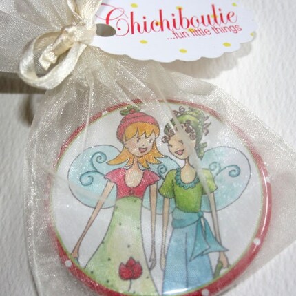
Nellie Belle badges


Pippa, paper doll

And here are Gretchen's colours......"Here you go! thank you for the interview. It was a fun one to do, but indigo really stumped me!"


Red - one of my favourite colours! So rich and bright and lively, I just love it! But only if it's a true red, a real cherry or watermelon red. Not orangey red at all for me. There's nothing wishy-washy about this true red in my mind. It's there and it definitely makes a statement. Red dresses, red shoes, red flowers, red scarves. All so classic and yet modern.

Orange - This is a more recent love for me. It used to remind me too much of the 70s and drab or oddly coloured kitchens and marigolds, not my favourite flower at all. But over the past few years I've come around to orange and discovered its vibrance. I love it with pink and peridot. It's such a happy colour in the end.

Yellow - Another colour I ignore a bit too often, but I put it down to my having blond hair and thus not wearing a lot of yellow. But I love a deep yellow, semolina coloured, the colour of Provence and Tuscany. A deep yellow is sunshine on a grey day to me.

Green - With red, my other favourite. I have had a love affair with green since I was just wee. My first "real" bicycle was green. I had green carpenter jeans when I was little. I still know the words to "It's Not Easy Being Green" sung by the illustrious Kermit the Frog. Green is fresh and happy. It goes with just about everything so apparently nature has gotten it right!

Blue - The ocean and the sky. A bright summer day. A refreshing, relaxing, calming colour. Amsterdam blue is one of my all-time favourite colours and Amersterdam blue shutters are my favourites on white washed houses.

Indigo - This one is the most difficult for me and I've left it for last. I still don't have big associations with it except maybe a brand new pair of deep indigo trousers. Crisp and richly coloured, wide-legged and cropped and just perfect for summertime.

Violet - admittedly not one of my favourite colours personally. I like my purples more on the blue side, but if I had to link violet to someone or something, it would be to my mother and her love of it! I think you can't think of this smiling woman who I often refer to (sorry mum) as a munchkin straight out of The Wizard of Oz without coming round to violet at some point.

Wednesday, March 4, 2009

Jennifer McGlon

Here is the third of a wee series of artist interviews based on the colours of the rainbow! It has been a fun project. What impact did each colour have on the artist's life. What is the strongest memory or association with it.

Jenn is a charming artist living in the suburbs of Chicago with her two sons, Jake and Henry aka Noodle and Lou, her husband and cat Mazzy. Her work is cheerful and full of whimsy. Jenn's ladies are bold and beautiful. Polka dots and stripes are always big faves. A little known fact is that Jenn and I are a tambourine and maraca duo available for hire! Bet you didn't know that! Jenn's work is available at her shop, Noodle and Lou and you can read her blog here!


Polkadot Dress

They put on their Party Hats

A Wonderful Day

And here are Jenn's colours......"I'm so happy to take part!"

Red: Red instantly reminds me of my Nanna's lipstick. We would stay with her and my PopPop in the summers and every Sunday she would get ready for church and put on her pretty red lipstick and Charlie perfume. Miss her. It also makes me think of my red sneakers when I was a little girl. I loved those sneakers like an old friend!

Orange: Orange reminds me of my living room in Florida. It was our very 1st house right around the time we were getting married. It was a darling little bungalow with some super sad paint colors. My parents came up and helped us paint the whole inside and I chose orange for the living and dining room. Everyone thought I was nuts but it turned out so FABULOUS. It was such a happy color and so funky:)

Yellow: Yellow reminds me of my favorite flowers...daisies. Forget big bouquets of roses...I'll take a bunch of daisies any ol' day!! And I can't think of yellow without thinking of the sun and of happy warmth:) I can't wait for Spring...

Green: I love green. Makes me think of nature and trees and walking barefoot in crunchy grass. It takes me back to when my son Jake was 3 and 4 years old and we had a huge back yard filled with all sorts of woods and moss and wildlife. He would stay out there for hours catching frogs in his little bug hut. When it was time to let them go, he would cry and cry. He loved the frogs so much. Sweet little Jake.

Blue: Blue is for my baby Henry's beautiful blue eyes and the beach of course. There is nothing more peaceful to me, than watching the water and listening to the waves. Taking walks along the beach. Looking for sea glass. Watching my kids hunt for crabs. Pure joy. I miss the beach so very much. I really do feel lost without it.

Purple: Reminds me of my Aunt Connie...she's always loved purple! And that pretty shade of hydrangeas (my other favorite flower!) that is a gorgeous blueish-purple. And, honestly, takes me straight back to Prince and "Purple Rain"!! Electric guitars, tons of jelly bracelets, leggings and big hair!

Pink: Pink makes me think of Betsey Johnson. Love her, love her, LOVE HER and she loves pink!! As a teenager, I clipped every single article and ad containing anything Betsey Johnson related. My parents went on a trip to NY and specifically went to one of her boutiques for me. They brought me back a PINK postcard along with a tee shirt, skirt and pair of bloomers. I dreamed of being a fashion designer like her. Now, I would settle for just going to lunch and a thrift shop with her. Call me Betsey! *wink wink*

Friday, February 27, 2009

COLOUR Interview: Tascha Parkinson

This is the second of a wee series of artist interviews based on the colours of the rainbow! It has been a fun project. What impact did each colour have on the artist's life. What is the strongest memory or association with it.

My second interview is with the delightful Tascha Parkinson of Toronto, Canada. The daughter of a painter, she carries on family tradition and creates the most wonderful, cheerful creations under the careful direction of her two Siamese cats, Opie and Lily. You can read her blog here and buy some of her art on eBay and and Etsy. Tascha has also dipped into the Youtube world and has some great art videos available to watch:) and of course there is  Facebook!


Little Red and the Wolf Cubs

Catching Snowflakes

Siamese Cat and Sushi

Here are Tascha's colours......"Thanks for letting me look back"

RED:
Back in art school I hung out with some people who loved bicycles. They rode them all over and would participate in what is called "critical mass". Every last Thursday of the month cyclists get together at Bloor and Spadina and ride their bikes through Toronto ringing their bells. I wanted a bike, so I went to the Goodwill, and there, was a vintage cruiser bike! I was so excited! It was from the 50's or 60's and it was a brown color. I went to Canadian Tire and bought a can of red enamel and painted the bike out on my balcony. I loved that bike! Unfortunately, it got stolen 5 years later.

ORANGE:
All the kitties I had growing up were orange colour. Then when I had my first apartment, I got Bailey. Another orange kitty. Everyone always remembers that about my childhood. That I always had orange cats.

YELLOW:
I grew up with my mom driving a yellow corvette stingray. BRIGHT YELLOW! You could always spot it in a parking lot!

GREEN:
Being part Irish green played a big part in my life. Four leaf clovers and such. Luck of the Irish. I always wore something green on St. Patrick's day.

BLUE:
This is a hard one. I guess I would say blue jeans. As a teenager I would try bleaching my jeans to have a tie-dyed appearance. I loved the wild pattern that would emerge from the areas that the bleach was stronger.

PURPLE:
Back in Art College I felt like this was my time to experiment with my hair. I dyed my hair purple. It was bright purple. I loved it! It was so hard to keep up though, and now I could never have the energy to maintain it.

PINK:
When I was about 18 I was in love with the movie "Pretty in Pink", I loved the way Molly Ringwald looked in that movie! I watched it about 100 times. It was a big part of my teenage life.

Thursday, February 26, 2009

Anne-Julie Aubry

I'm doing a wee series of artist interviews based on the colours of the rainbow! It has been a fun project. What impact did each colour have on the artist's life. What is the strongest memory or association with it.


Spiral of Dream

My first interview is with Anne-Julie Aubry a young artist who lives in the south of France. Her exquisite work is luscious and mysterious. You can see more art at her etsy shop TheNebulous Kingdom and read her blog here. Ann-Julie's sometimes dark but always whimsical work is also available on skins for Ipods, Iphones, Laptops (Mac and Pc), Netbooks and now Nintendo DS Lite at Skinizi.com.


Mon Petite Monde


Springtime Blossom

Here are her colours:)

"Oh thank you for inviting me in such a great experience, it's definitely a really great little game about our memories. I love it! "

Red - I think of poppies, always poppies because I love to draw or paint them. I've always been in love with these flowers, like an obsession since my youngest age.

Orange - Orange is the color of Etsy. I cannot think of anything else, Etsy came in mind instantly. I'm very addicted to this website, it's also my community and running a shop here is my full time job.

Yellow - One of the first car of my parents was yellow. It was a fun one, from a German brand to avoid any details, in a funny and gorgeous lemon-yellow color. I loved this car, I have very good memories of it.

Green - Is the color I'm very connected to in my work. I always add a touch of green in every of my illustration, even a little.. tiny one! This is the color of the Earth and that means for me the color of Hope.

Blue - When I think of blue I think of my grandma's bedroom. She loves the color blue, and her bedroom has always been dedicated to this color. The walls, the fitted carpet, the curtains, everything. She has wonderful tastes, and a great ability to marry different shades of blue. It's a gorgeous bedroom, and could be featured in a decorating book me thinks!

Indigo/purple - The amazing tones of the sky at nightfall here in the south, at the sea. I'm living here since almost 5 years now, and this is something I definitely love. I feel lucky each time I can take a few minutes and stare at a beautiful nightfall... Most of the time I can see pink and orange tones as well, a pure chef d'oeuvre.

Violet/pink - Is the gorgeous color of my grandma's beautiful hydrangeas in her garden. As far as I remember, those (giant now) flowers have always been in her garden, and she really really cares about them.